Sunday, April 10, 2011

Example of an Autoregressive Forecasting Model

1.  Background Information on the Time Series Data:

The first purpose of this blog is to demonstrate the model building approach commonly known as Box-Jenkins or ARIMA methodology.  (ARIMA stands for autoregressive integrated moving average.)  The second purpose is to demonstrate how forecasts can be produced from the fitted ARIMA model.

This blog uses a time series consisting of 75 observations.  I call this time series Yt, which is normal for forecasting models.  What this means is that observations were collected over time and entered into the computer (Minitab) in chronological order.

The time series is examined first using autocorrelation and partial autocorrelation functions.  This preliminary examination suggests that an autoregressive model of order 1 fits the data.  This autoregressive model of order 1, also known as an AR(1) model, is built and coefficients are estimated.  The model's adequacy is verified using a number of diagnostic tests to ensure that the residuals are random, normally distributed, and contain few outliers.  Then, four forecasts are made.

Below is the time series plot of Yt.


2.  Identifying a Model to be Tentatively Entertained:

To identify a potential model using the Box-Jenkins methodology, we begin by producing both the autocorrelation function and the partial autocorrelation function for the original time series data.  Then, these two graphical outputs are compared with theoretical graphical outputs to see if a match between them can be found.  This matching process helps narrow down which kind of model we should build.  We have numerous options such as building an autoregressive model, a moving average model, a mixed model, a differenced data model, and even a model with seasonal components.  We have more options, for example, we could pick an autoregressive model of order 1, or of order 2, or of order 3 depending on the number of terms we want to include on the right-hand side of the equation.  Therefore, we use this graphical matching process in order to reduce the number of options that we need to consider.

The autocorrelation function is a graphical display of various autocorrelation coefficients for various time lags. An autocorrelation coefficient is a measure of correlation between two variables:  the original time series variable and the lagged version of this same time series variable.  For example, a lag 2 autocorrelation coefficient is a measure of correlation between the original data and the original data lagged two periods.  For monthly data, lagging two periods means that we shift an observation from January to March and that we shift an observation from February to April and so on.  A lag 3 autocorrelation would involve shifting an observation from January to April and would involve shifting an observation from February to May.  The graph puts the various time lags on the horizontal axis and plots the autocorrelation coefficients as black lines extending upward or downward.  The autocorrelation coefficients are the little black lines that stick up or down and they appear all the way across the middle section of the graph.

The partial autocorrelation function is conceptually very similar to the autocorrelation function.  It too is a graphical output containing various partial autocorrelation coefficients computed for various time lags.  Again, the various time lags are put along the horizontal axis and the partial autocorrelation coefficients are plots as black lines extending upward or downward.  Moreover, a partial autocorrelation coefficient can be thought of as a correlation between the original time series data and a lagged version of the time series data.  The difference between the partial autocorrelation coefficients and the autocorrelation coefficients is that the partial autocorrelation coefficients are computed in such a way that the effects of the intervening time lags are taken into account.  So for example, a partial autocorrelation coefficient at time lag 12 is the correlation between the original time series and the time series lagged 12 periods and we have adjusted for the effects of the intervening values, i.e., we have adjusted for the effects of the lagged 1 through lagged 11 data.

Here are the autocorrelation and partial autocorrelation functions for the original time series data.  The most striking feature of these two plots is the strongly negative (downward pointing) partial autocorrelation coefficient at lag 1.  Then, the rest of the partial autocorrelation coefficients are all very small and close to zero, i.e., the black lines at the other time lags are all very short.  This is suggestive of an autoregressive model of order 1, usually abbreviated AR(1).  The reason it is suggestive is because I compared this partial autocorrelation function to the theoretical graphs from a book that I have and this picture is classified under the AR(1) function.


3.  Estimating Parameters in the Tentatively Entertained Model:

To estimate the autoregressive model of order 1, or AR(1), I utilize Minitab's ARIMA program.  The computer ran 7 iterations and then estimated the parameters of the model.  The Minitab results are presented next.


Final Estimates of Parameters
Type          Coef     SE Coef         T        P
AR   1     -0.5376      0.0986     -5.45    0.000
Constant   115.829       1.356     85.42    0.000
Mean       75.3310      0.8818


Minitab has estimated the following equation:


Yt = φ0 + φ1Yt - 1 + εt

Minitab also estimates the values of the coefficients.  The estimated values of the coefficients are:

φ0 = 115.829

φ1 = - 0.5376

Finally, using these coefficient estimates, we can easily derive the forecasting function.  (In regression terminology, this would be called the Y-hat function).  We can use this function to forecast future values of Yt.  Of course, first we will have to verify that the AR(1) model is adequate.  This forecasting function is:


Y(forecast)t = 115.829 – 0.5376 Yt - 1


4.  Diagnostic Checking:

A number of tests have to be run in order to make sure that the model is satisfactory.  We want to ensure that the residuals of this AR(1) model are random.  Moreover, we also want to make sure that the residuals are normally distributed and that they contain few outliers.  The individual residual autocorrelations have to be checked to make sure that they are small and close to zero.  An overall test of model adequacy is provided by the chi-square test based on the Ljung-Box Q statistic.  This overall test looks at the sizes of the residual autocorrelations as a group.  (It is a portmanteau test).

The first test that I run is the Modified Box-Pierce or Ljung-Box chi-square test.  This test checks a number of residual autocorrelations simultaneously to see whether they are all random or not.  If the p value is small, i.e., less than 0.05, the model is considered inadequate.  Since this test at lags 12, 24, 36, and 48 has p-values that are all much larger than 0.05, the model can be deemed adequate.  What this test is telling us is that a set of residual autocorrelations is not significantly different from what we would expect to find when looking at a set of random residuals.  In other words, the residuals are random.


Modified Box-Pierce (Ljung-Box) Chi-Square statistic


Lag               12        24        36        48
Chi-Square       9.3      29.8      37.2      58.2
DF                10        22        34        46
P-Value        0.508     0.124     0.324     0.107


The next graph is the autocorrelation function of the residuals.  This plot shows the individual residual autocorrelations.  The 95% confidence limit is used to test whether a residual autocorrelation coefficient is significantly different from zero.  A residual autocorrelation coefficient would be significantly different from zero if the black line were to extend upward of downward and penetrate through one of the confidence intervals (the red lines).  Since this never happens in this plot, we can again conclude that the residuals are random; the residual autocorrelations are not significantly different from zero.


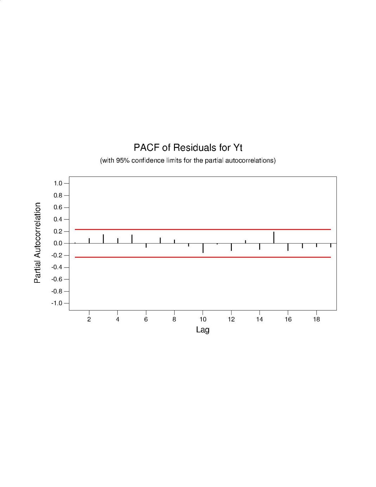
The next graph is the partial autocorrelation function of the residuals.  We interpret it using the same general rules that are used for the autocorrelation function.  If a black line penetrated through a red line we have to worry because this suggests non-random residuals.  If the black lines do not penetrate through the red lines then we most likely have random residuals.  We can again conclude that the residuals from this graph.


The next two graphs are used to check the residuals for normality.  The normal probability plot is a visual way of checking for normality.  If the residuals are normally distributed, then the plot should appear to fall along a straight line.  If many residuals diverge radically from the straight line then the residuals are non-normal.  The Anderson-Darling Normality test is another way to check the residuals for normality.  This test has a null hypothesis that says that the residuals follow a normal distribution.  Since the p-value for this test is 0.539, we fail to reject the null hypothesis and conclude that the residuals are most likely normally distributed.


The last test that I run is to plot the residuals against the order of the data.  Notice that almost all of the residuals are clustered around 0, plus or minus 20.  This is an encouraging sign because we expect that the average value of the residuals should be zero and the residuals should have a constant variance across time.  There are only a few residuals that deviate outside of this band.  This suggests that few residuals could be classified as outliers.  We want to have few outliers; this plot confirms that we have few of them.


5.  Using the AR(1) Model for Forecasting:


Since the model passed the diagnosis phase, it can be used to develop forecasts of future values.  I once again use Minitab to produce four forecasts.  The data in the original time series ran from time period 1 to time period 75.  Consequently, the four forecasts are made for time periods 76, 77, 78, and 79.  The results are presented next.


Forecasts from period 75
                             95 Percent Limits
Period      Forecast        Lower        Upper       Actual
  76          77.122       54.102      100.142
  77          74.368       48.232      100.504
  78          75.849       48.879      102.818
  79          75.053       47.847      102.258


The forecasts and presented in the second column above.  The 95% limits give us a range of values for these forecasts because the forecasts contain a degree of uncertainty.  For example, the forecast for time period 76 is 77.122.  However, the 95% limit tells us that the actual value could very likely fall somewhere in between 54 and 100.  This spread of possible values warns the user to keep in mind that the 77.122 figure is not to be taken as an unquestionable truth.  It is simply a point estimate that solves the AR(1) equation.  


Thursday, April 7, 2011

Example of Time Series Regression

1.  Background Information:


This time series model is being built in order to predict future electrical usage for a power plant.  In this example, the power plant management have collected quarterly data starting with the first quarter of 1980 and ending with the second quarter of 1996.  In total, we have a sample size of 66, i.e., one observation is taken per quarter.  


First, the regression model has to be built.  Then, four forecasts will be made, i.e., for times 67, 68, 69, and 70; in words, the forecasts will be made for the 3rd Quarter of 1996, the 4th Quarter of 1996, the 1st Quarter of 1997, and the 2nd Quarter of 1997.  Keep in mind that the "current time period" is the 2nd quarter of 1996; consequently, we can view these as future forecasts.  


2.  The Response Variable:


The variable that we want to predict is labeled "Hours" and stands for electrical usage measured in millions of kilowatt hours per quarter.  Basically, we are looking to forecast the demand for electricity at this power plant for the next four quarters in the future.


3.  The Predictor Variables:

  1. "Time":  This variable is meant to capture the positive or upward trend in the data.   The coding procedure is fairly straightforward.  The first observation occurs in the first Quarter of 1980 and is coded as "time 1."  The second observation occurs in the second Quarter of 1980 and is coded as "time 2."  The third observation occurs in the third Quarter of 1980 and is coded as "time 3."  This pattern continues, so that the for example, the fifth observation occurs in the first Quarter of 1981 and is coded as "time 5."
  2. "2nd Qt":  This dummy variable takes on the value 1 if the observation takes place during the second quarter of the year.  It takes on the value 0 if the observation takes place during any other quarter of the year.
  3. "3rd Qt":  This dummy variable takes on the value 1 if the observation takes place during the third quarter of the year.  It takes on the value 0 if the observation takes place during any other quarter of the year.
  4. "4th Qt":  This dummy variable takes on the value 1 if the observation takes place during the fourth quarter of the year.  It takes on the value 0 if the observation takes place during any other quarter of the year.
  5. (Implied variable):  To capture the situation when the observation takes place during the first quarter of the year, we simply do nothing.  This has already been captured.  This occurs when "2nd Qt" = 0 and "3rd Qt" = 0 and "4th Qt" = 0.  We are saying, that the observation does not happen in the 2nd Quarter, the observation does not happen in the 3rd Quarter, and the observation does not happen in the 4th Quarter.  Therefore, since there are only 4 quarters in the year, the only option left is for it to be in the 1st Quarter.
4.  Graphical Inspection of the Data:

The simplest way to analyze time series data is to plot the response variable of "Hours" against time to see what it looks like.  This simple time series plot appears first below.  The second picture is the autocorrelation function for this "Hours" variable.  The idea behind an autocorrelation function is to lag data and run a correlation analysis between the actual data and the time lagged data.  The purpose for doing so is to help spot whether the data has a trend and/or a seasonal pattern in it.


The autocorrelation function produces these black bars that indicate the different autocorrelations at various time lags.  When the bar breaks through the red line (the confidence interval) then this indicates we have something statistically significant (it implies a correlation that is significantly different from zero).  

What exactly is an autocorrelation?  What exactly does it mean?  A simple example using a lag of 4.  Since this is quarterly data, a lag of 4 means that we are comparing data for a correlation analysis as follows:  Quarter 1 of 1980 will be compared with Quarter 1 of 1981; Quarter 2 of 1980 will be compared with Quarter 2 of 1981 and so on.  Basically, we are seeing whether or not a pattern exists in the data so that Quarter 1's across time are similar, Quarter 2's across time are similar and so on.  We are looking for the seasonal pattern.

In this example, the lag 4 correlation is 0.87.  This means that Quarter 1 of 1980 is very similar to Quarter 1 of 1981; Quarter 2 of 1980 is very similar to Quarter 2 of 1981 and so on.  For example, we can say that Quarter 1 of 1985 is similar to Quarter 1 of 1986 and so on.  We are picking up on the fact that the data has a repeating pattern every year probably driven by the fact that weather influences electricity demand and weather follows fairly predicable seasons year after year.

The easiest way to see the upward trend would be to do a simple linear regression of "Hours" against time and have Minitab (the program used for this analysis) fit a trend line.  The results are presented next.  Visually, you can see the positive upward slope of the blue trend line.  The equation confirms this because the slope of the trend line is positive.

 
5.  The Regression Model Conceptually:

The above analysis suggests that we have to model a trend and seasonal data.  This is why it makes sense to include the trend and season variables.

The general estimation equation that Minitab will estimate takes the following form:

Estimated Hours = b0 + b1 "Time" + b2 "2nd Qt" + b3 "3rd Qt" + b4 "4th Qt"

Where:

b0 is the constant term or intercept term
b1 is the slope term or coefficient on the "Time" variable
b2 is the coefficient on the "2nd Qt" variable
b3 is the coefficient on the "3rd Qt" variable
b4 is the coefficient on the "4th Qt" variable

We can easily derive from this equation the estimation equations for each quarter.  This is done simply by substituting in the appropriate 1's and 0's into this general estimation equation for each case.

The estimation equation for the First Quarter:

The first quarter is captured when "2nd Qt" = 0;  "3rd Qt" = 0; and "4th Qt" = 0.

Estimated Hours for the First Quarter = b0 + b1 "Time"

The estimation equation for the Second Quarter:

The second quarter is captured when "2nd Qt" = 1; "3rd Qt" = 0; and "4th Qt" = 0.

Estimated Hours for the Second Quarter = b0 + b2 + b1 "Time"

The estimation equation for the Third Quarter:

The third quarter is captured when "2nd Qt" = 0; "3rd Qt" = 1; and "4th Qt" = 0.

Estimated Hours for the Third Quarter = b0 + b3 + b1 "Time"

The estimation equation for the Fourth Quarter:

The fourth quarter is captured when "2nd Qt" = 0; "3rd Qt" = 0; and "4th Qt" = 1.

Estimated Hours for the Fourth Quarter = b0 + b4 + b1 "Time"

In other words, we have four estimation equations, all with the same slope (b1) but with different constant terms or intercepts.

6.  The Regression Output and Interpretation:

Here are the regression results.  I have included four forecasts for times 67, 68, 69, and 70, i.e., forecasts of "Hours" for 3rd Quarter 1996, 4th Quarter 1996, 1st Quarter 1997, and 2nd Quarter 1997.

The regression equation is
Hours = 968 + 0.938 Time - 342 2nd Qt - 472 3rd Qt - 230 4th Qt

Predictor        Coef     SE Coef          T        P
Constant       968.39       16.88      57.38    0.000
Time           0.9383      0.3377       2.78    0.007
2nd Qt        -341.94       17.92     -19.08    0.000
3rd Qt        -471.60       18.20     -25.91    0.000
4th Qt        -230.23       18.20     -12.65    0.000

S = 52.25       R-Sq = 92.4%     R-Sq(adj) = 91.9%

Analysis of Variance

Source            DF          SS          MS         F        P
Regression         4     2012975      503244    184.34    0.000
Residual Error    61      166526        2730
Total             65     2179502

Durbin-Watson statistic = 1.48

Predicted Values for New Observations

New Obs     Fit     SE Fit         95.0% CI             95.0% PI
1        559.65      17.39   (  524.87,  594.43)  (  449.54,  669.76)  
2        801.96      17.39   (  767.19,  836.74)  (  691.85,  912.08)  
3       1033.13      17.56   (  998.01, 1068.25)  (  922.91, 1143.35)  
4        692.13      17.56   (  657.01,  727.25)  (  581.91,  802.35)  

Values of Predictors for New Observations

New Obs      Time    2nd Qt    3rd Qt    4th Qt
1            67.0      0.00      1.00      0.00
2            68.0      0.00      0.00      1.00
3            69.0      0.00      0.00      0.00
4            70.0      1.00      0.00      0.00


The Minitab output begins with the regression equation.  Instead of using b0, b1, b2, b3, b4 as generic coefficients, the program has substituted in the regression estimates for these values.  The coefficient value of 0.9383 is positive.  This positive value makes sense; it tells us that if we increase "Time" then the Estimated Hours will go up.  To see this, take a look at the First Quarter Estimation equation.

Estimated Hours for the First Quarter = b0 + b1 "Time"

Or, if we substitute in the values for b0 and b1 from the regression equation we get:

Estimated Hours for the First Quarter = 968.39 + 0.9383 "Time"

The t-tests and p-values are meant to determine whether or not the coefficients are significantly different from zero.  We want them to be different from zero.  The fact that all the p-values are much less than 0.05 is very good news.  In fact, all the p-values are below 0.01.  This tells us that we can reject the null hypotheses that each population coefficient is 0.  

The R-sq or R-squared statistic is a measure of the ratio of sum of squares regression divided by sum of squares total.  (These numbers come from the Analysis of Variance chart immediately below this statistic in the chart above.)  In this case, the 92.4% means that 92.4% of the variation in "Hours" is explained by the predictor variables.  This means that most of the variation that we want to explain has been explained.  

The analysis of variance table also reports the F statistic with the associated p-value.  The F-Test tests the null hypothesis that ALL the slope coefficients are zero.  In this case, the null hypothesis is that b1 = b2 = b3 = b4 = 0.  With the p-value virtually zero and the F-value so large, we can conclude that at least one of the four regression slope coefficients is different from zero.  This again is a good sign.  We want this result since we want to find values different from zero.

The Durbin-Watson statistic is important for model checking.  It is meant to check to see whether positive first-order autocorrelation exists in the residuals or error terms of the regression model.  The error terms are supposed to be independent and normally distributed with a mean of zero and a constant variance.  With time series data, we can easily run into the problem where the error term in one period is related to the error term in the preceding time period.  This is the issue that the Durbin-Watson test is addressing.  

I ran the Durbin-Watson test manually (I had to look up the values in a table).  I used n = 65 for the sample size (even though the real sample size is 66) since 65 is the closest entry in my chart.  I used k = 4 since there are four independent variables in this model (i.e., "Time", and the three dummy variables).  I used the significance level of alpha = 0.05.  From the chart we get upper and lower bounds for the Durbin-Watson test.

dL = 1.47 (lower bound)
dU = 1.73 (upper bound)
DW = 1.48 (the Durbin-Watson statistic from the regression results above)

Unfortunately, we have situation where lower bound < DW < upper bound (specifically we have the situation where 1.47 < 1.48 <1.73.  Therefore, the test is inconclusive.

A deeper analysis would continue with the residuals or error terms of the model.  We would investigate the autocorrelation functions to see whether any of the lagged residuals display significant correlations.  When I did this, I found that most of the lagged correlations are fairly small.  The largest value was 0.24.  Also, none of the black bars penetrated through the red-line or confidence interval.  This implies that none of the lagged correlations are significantly different from zero.  This is a good sign.  We want the errors to be random; hence, we do not want to find patterns in the error terms over time.

Then, I did some predictions using Minitab to forecast four future observations on "Hours."  The program first estimates the fitted value.  This is simply done by sticking in the appropriate values of the predictor variables into the appropriate estimation equations.  Then, the program calculates 95% CI (confidence intervals) and 95% PI (prediction intervals).  What is going on here is that the fitted values are guesses and so they have to be interpreted with care.  The intervals are trying to capture certain aspects of uncertainty in calculating these fitted values.  For example, we have to take into account the fact that data points do not fall perfectly on our estimated regression line.  Moreover, we have to also take into account the fact that we are estimating a sample regression line and not the population regression line.  Maybe this company has additional years of data before 1980--maybe going back to the 1920s.  We have not used all of this data and so we cannot know for sure whether our sample regression line is similar to the population regression line.  Because of these uncertainty issues, Minitab gives up these ranges of values--ideally we want the range of possible values for the forecast value to be as small as possible.